INTERACTIVE PRESENTATION OF PERSONAL CARE CATEGORY
OPEN SALES, FROM DOOR TO FLOOR
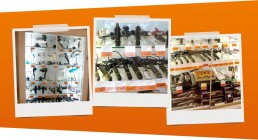
Personal care products at Blokker were always behind glass. Touching and feeling a product was only possible if an employee opened the display case. This valuable category deserved a completely new approach with a more open character. Products needed to be touchable without the intervention of staff.
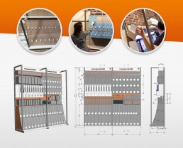
In 2014, we were tasked with reinventing the shelf. Creative pioneering, combined with the shopper psychology knowledge of Procter & Gamble and the latest in-store techniques from Mood Media, resulted in the interactive personal care wall found in all renovated branches today. Of course, built based on feedback obtained from various shopper surveys.
INTERACTIVE SHELF
SHOPPER RESEARCH
CATEGORY VISION
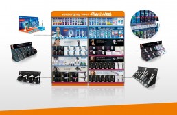
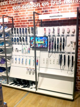
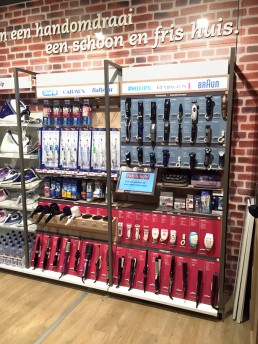
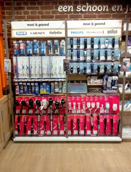
The 2-meter personal care section with over 74 products is clearly organized for the consumer, making decision-making easier. Navigation within the category is facilitated by a recognizable signpost. Within the shelf, there is a subdivision between oral care, women's products, and men's products.
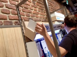
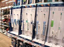
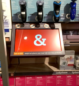
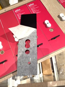
Everything is segmented into brand blocks with a good, better, best structure within them. The easily interchangeable specification cards display basic information per product. When the product is picked up, the smart snapper technique displays additional information on the screen.
GB10 handled the entire production and organization, from planning to coordination and implementation. The interactive personal care wall is now found in almost all stores in the Netherlands and Belgium and can genuinely be called a successful category concept.
